Totallymoney's Icon Revamp
TotallyMoney needed a scalable, consistent icon library to improve product clarity and unify visual language across their platforms. Their existing icons were inconsistent in style, weight, and visual balance, which led to brand fragmentation and usability issues.
My Role
I led the redesign of the entire icon set, from initial audits to final implementation guidelines, ensuring all assets aligned with brand tone and accessibility standards.
Process
Conducted a full audit of existing icons, identifying style clashes and gaps in the library.
Defined a consistent stroke weight, corner radius, and geometric grid to ensure harmony across icons.
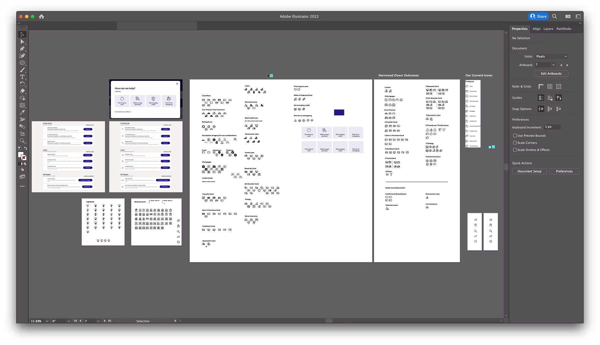
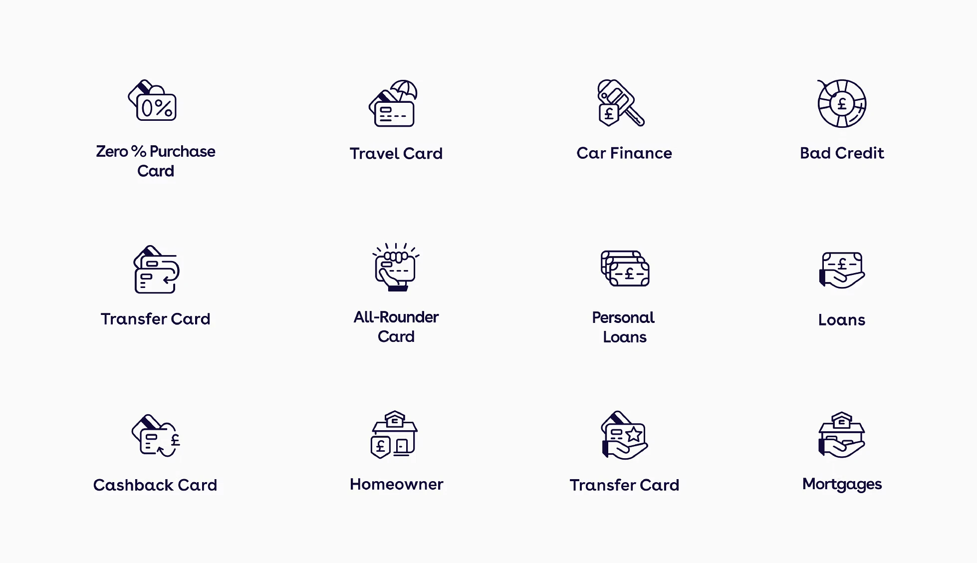
Designed new icons to cover all product and financial service categories, keeping forms simple, recognisable, and optimised for small sizes.
Created visual usage guidelines for spacing, alignment, and naming conventions to maintain consistency as the library grows.
Delivered SVG and vector formats ready for digital and print use.

Outcome
The redesigned icon set delivered a consistent, modern and highly legible visual language across 18 key product categories used throughout the TotallyMoney platform. By addressing scalability issues and unifying the style, the new icons improved recognition and usability at small sizes, reducing user misclicks and navigation errors. The cohesive look strengthened brand perception, giving the platform a more premium and professional feel while aligning with accessibility best practices. This systemised approach also futureproofed the library, making it faster and easier for the design team to expand the set without sacrificing consistency.


Conclusion
The new icon system not only strengthened TotallyMoney’s visual identity but also improved the speed and accuracy of user decision-making. It provides a long-term foundation for future product and marketing design work.